Friday, November 18, 2011

More Pages from the Mini Mica Book

Here are a few more page spreads from the Mini Mica Book. Some of the techniques used are embossing, ink jet transfer and stenciling with acrylic light molding paste.  


Saturday, October 15, 2011

Inside pages from the Mini-Mica Book

Thank you to everyone for all the positive and encouraging comments about my big news!  It is always great to hear from you.
Here are some of the inside pages of the smallest book (3" x 3") that I submitted:


Friday, October 14, 2011

Cloth Paper Scissors chooses 2012 artisans!

This morning I was so excited to find out that I was selected as Cloth Paper Scissors' artisan of the year for 2012 in the Art Journaling and Bookmaking category!!! My previous posts have all featured pages from these books. I am so honored that my journals were chosen. Here are the photos of the winning books:


Wednesday, October 12, 2011

Pages with windows

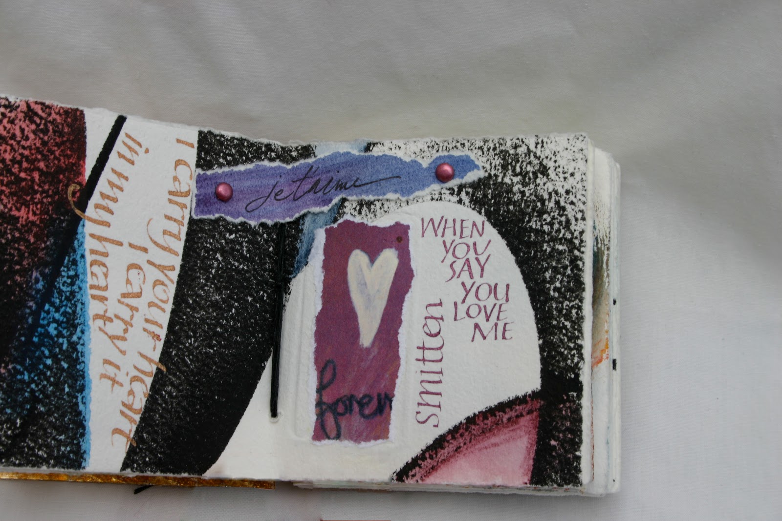
This book features windows cut into the pages. They make design challenging, but add so much interest to the whole piece. Here are some details:

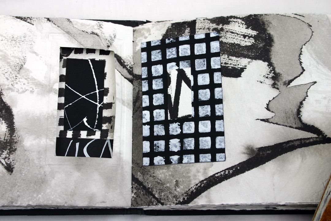
Window on the right, showing a bit of the color underneath:


 Turn the page and the widow is on the left, reframing the collage on that page, and showing another window on the right:


Here's a detail of the collage on the left-hand page:


Tuesday, October 11, 2011

Sunday, October 9, 2011

More inside pages form the Black and White Book

Since my last post, I was surprised and thrilled when I found out that these books have become finalists in the Cloth Paper Scissors 2012 Artisan Search.  Here are more of the pages from the Black and White Book:


The third page spread has an inkjet transfer of lettering on the left side.

Friday, September 2, 2011

Inside pages of Black and White book

Here are a few pages inside the Black and White Book:


Materials used: Arches Text wove paper, Strathmore black paper, Sumi Ink, Winsor Newton permanent white gouache, metal nibs and stamps.

Thursday, September 1, 2011

Black and White Book

This little book was inspired by last spring's workshop with Rosie Kelly. Here's the cover and view of the spine:


Wednesday, August 31, 2011

Tuesday, August 30, 2011

Cover of the Funky Chunky Journal

This is the cover of the Funky Chunky Journal:

 In this detail, you can see the frame inset into the cover.  The central gold embellishment was created with Mold n' Pour and a large button. Then the mold was filled with  hot glue. Once the glue was cool, I covered it with gold leaf. This is one of the techniques that I teach in my class X-treme Gilding.


Monday, August 29, 2011

More pages from art journal

Here is the continuing development of the art journal.  I named it "Funky Chunky Journal."
On this page: inkjet transfers of butterflies and Bob Dylan, my own Tempis Fugit stamp, and torn pieces  of calligraphy from various projects.


Tuesday, August 23, 2011

Pages with windows

Cutting windows into pages is one of my favorite techniques.  The placement of a window is challenging, because the opening reveals whatever is "underneath" that page -- on the right and also on the left. Windows act as frames for art -- either a section that is intentionally designed, or a little happy accident.


Monday, August 22, 2011

Adding embellishments

Each day that I work in this book I am building up the layers.  I have seen some beautiful projects lately, and am aware that I am dimensionally challenged!  In these pages I am incorporating embellishments that have some depth to them. I am also adding cloth and fibers for more texture.


Sunday, August 21, 2011

Pages with pockets

As I am working in this journal, I am trying different techniques and ideas. Here are some pages with pockets and tags. 


Tuesday, August 16, 2011

How I work

In my art, I am all about process. I love to sit and letter and can get absorbed in that. When I am done lettering, it's easy to sit back and say, well, that is finished. A few years ago I began to cut up some "failed" calligraphy pieces, and it was a wonderfully liberating experience.  All of a sudden, the pieces weren't precious, and the quality of the lettering didn't matter. Neither did legibility.  There is a lot of freedom when the pressure to be perfect is taken away.

So, here are some pages with my own lettering torn or cut up.


Monday, August 15, 2011

Changes over time

Part of what I love about these kinds of sketchbooks is that I can go back and update, or add to what I have already done.  It is helpful to let some designs sit for a while, and then reevaluate them, and make changes.  

This spread a few days ago: 


Same spread with white paint added: